How Colors Shape Emotions and User Perception
Hi everyone 👋 I’m Burcu, and today I want to talk about something I’ve always found fascinating — how colors can completely change the way we feel about a design.
In UI design, color isn’t just decoration. It’s emotion, communication, and personality all in one. The right shade can make a product feel trustworthy, exciting, or calming — and that’s exactly what makes color psychology such an important part of UX/UI.
💡 The Emotional Power of Color
Colors trigger emotional responses within seconds. Each hue carries psychological meaning that influences how users connect with a product. Understanding these emotional cues helps designers create purposeful and engaging experiences.
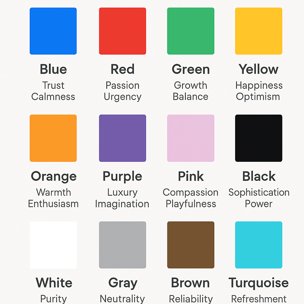
- Blue — trust, calmness, and intelligence. Used by brands like PayPal, Facebook, and IBM to build credibility.
- Red — passion, urgency, and excitement. Great for attention-grabbing elements or alerts.
- Green — growth, balance, and health. Ideal for eco-friendly, wellness, or finance designs.
- Yellow — happiness, creativity, and optimism. Works well for friendly, approachable brands.
- Orange — warmth, enthusiasm, and confidence. Often used in calls to action and tech startups to inspire energy.
- Purple — luxury, imagination, and wisdom. Common in beauty, education, and creative industries.
- Pink — compassion, femininity, and playfulness. Great for lifestyle and community-focused apps.
- Black — sophistication, power, and elegance. Strong when paired with minimalist layouts.
- White — purity, simplicity, and space. Enhances readability and creates balance.
- Gray — neutrality and stability. Excellent as a background color to highlight other tones.
- Brown — reliability, comfort, and nature. Works well in organic, home, or craft-based products.
- Turquoise / Teal — refreshment and emotional clarity. Often used in wellness and modern tech interfaces.
When combined strategically, these colors influence how users feel, make decisions, and remember your product.
Building a Meaningful Color Palette
Creating an effective color system starts with understanding your product’s goals and brand personality.
- Choose a primary color that expresses your core identity.
- Add accent colors to highlight actions or interactive elements.
- Use neutrals for balance, readability, and visual structure.
- Test your palette on different screen types and lighting conditions.
Consistency is key — when colors remain cohesive across your interface, users develop recognition and trust.
Accessibility and Contrast Matter
Great design is inclusive. Accessibility in color design ensures that all users — including those with visual impairments — can easily read and navigate your interface.
Use tools like Contrast Checker or Stark for Figma to confirm your palette meets WCAG accessibility standards. High contrast improves both usability and visual impact.
Final Thoughts
In UI design, color is more than decoration — it’s a form of communication. The right colors can evoke emotion, strengthen brand perception, and guide user behavior.
When designers understand color psychology, they don’t just create something that looks good — they design experiences that feel right.
I hope this post helps you see colors a little differently next time you open Figma or start a new project.
Thanks for reading! I’d love to hear what color inspires you the most in your designs. Let’s keep learning and creating meaningful visuals together


 Lunaru Design
Leave a comment